“7 Must-Have Powerful Features of a User-Friendly Website”

Umar
September 4, 2025
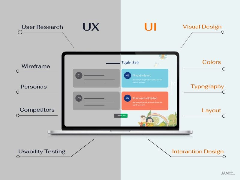
I want to be real with you—when most business owners consider a website, they immediately think design. Gaudy layouts, bold colors, and hero imagery come to mind. But here’s the cold hard truth: without a user-friendly website, all the design in the universe won’t help you.
I’ve worked with dozens of startups, small businesses, and even big brands. And one thing keeps popping up: businesses spend thousands on flashy designs, but they completely forget the experience. Visitors come, get frustrated, and leave. Boom—opportunity lost.
So what makes a website really user friendly? It’s not all about looking pretty. It’s about creating a site that people love to work with, trust, and return to. Today, I’m going to dissect the 7 must-have elements of a user friendly website, why they’re important, and provide you with real examples that you can start using now.
We’ll also throw in some advice on user friendly website design, good website features, and even some user friendly website examples that you can pick up from.
Take you through the example of entering a shop where everything is not labeled and aisles lead everywhere. Confusing, isn’t it? That’s exactly what a confusing website does to website visitors.
An easy-to-use website will have navigation that is easy, intuitive, and foreseeable. Menu titles should be obvious (“Services” rather than “What We Do”), and pages should be logically organized into groups. You want users to find what they need in three clicks or fewer.
For instance, I helped a tiny online education startup. Their previous site menu was a jumbled mess: “Resources,” “Learning,” “Start Here,” “Tools”—complete chaos. Users were bouncing quick. Following a redesign with a neat, rational menu, their bounce rate fell 25%, and time on site went up 40%.
Pro tip: Always ask yourself: “If I were a first-time visitor, could I find what I need in under 30 seconds?”
The harsh reality here is that time is of the essence. Google states that 53% of mobile users abandon a site that doesn’t load within 3 seconds.
A friendly website loads quickly. Minimize images, reduce heavy scripts, and take advantage of caching. A gorgeous website doesn’t matter if it infuriates users by taking too long.
For example, one of my clients—a small online store—was losing sales due to slow-loading pages. We did some optimization of images, tidied up code, and added caching. Result? Their conversion rate rose by 18% in just a single month.
Remember: speed isn’t just for user satisfaction—it also benefits your SEO, which brings you more organic traffic in the long run.


Here’s a mindblowing stat: more than 60% of web traffic is generated through mobile. But so many websites appear as minuscule versions of their desktop website on mobile.
An user friendly website design has to be compliant with each screen size. Fonts have to be legible, buttons have to be tap-able, and content organized in a neat manner. You wouldn’t want people pinching, zooming, or scrolling forever.
Take Airbnb, for example. Open it on your phone—it’s responsive, intuitive, and quick. That’s why it succeeds. And yes, a mobile-friendly website is not a choice anymore; it’s obligatory.
Visualize entering a shop with no “Buy” signs, no cashier counter, and no personnel to direct you. Disorienting, isn’t it? That’s a website lacking clear CTAs.
One good feature of a website is a prominently situated, clear, and action-oriented CTA. Whether “Sign Up Now,” “Get a Free Trial,” or “Book a Consultation,” the user should be crystal clear about what to do next.
I recall one SaaS client who was burying CTAs at the bottom of their site. We brought them above the fold and made them bright and bold with contrasting hues. Results? Click-through rates increased 32%.
Pro tip: Less is more. Don’t blind visitors with 10 CTAs on one page. Point them toward a single action per page.
Content is king, but clarity rules. A user friendly website conveys ideas in brief, concise terms. Visitors don’t have the time to decode massive walls of text.
Use:
Short paragraphs
Bullet points
Headers
Visuals such as images, infographics, and videos
For instance, HubSpot blog posts are lengthy but divided into scannable sections, with bold and visuals. That’s why they are so readable and engaging.
Keep in mind: your intention is to inform, educate, and guide users. Each piece of content should resolve an issue or answer a question.
It gets neglected often. If you have a lot of content on your site—such as blogs, products, or tutorials—add a search bar. It enables users to find what they want in an instant without click-happy exhaustion.
One of my clients in the tourism sector had hundreds of travel blog posts. Adding a search bar with filters boosted engagement and minimized bounce rate. Users were able to find what they were looking for within seconds rather than abandoning it out of frustration.
Tip: Keep your search intuitive. Add auto-suggestions, categories, and filters. Smart search is a simple website feature that makes visitors smile.
Trust is the currency of the internet. Visitors won’t buy, sign up, or interact if your site doesn’t feel secure.
A user friendly site will have SSL certificates, privacy policies, prominent security badges, and easy-to-find contact information. Even little things such as testimonials or trust seals can be a game changer.
I had one small e-commerce business selling handmade items. After adding SSL, a simple “Secure Checkout” badge, and some customer reviews, sales jumped by 15%.
Keep in mind: security is trust, and trust is conversions.
Need inspiration? Get a look at these:
Apple.com – Simple design, quick, responsive, and easy to use.
Airbnb.com – Clear calls to action, engaging graphics, and mobile-dedaructive.
HubSpot.com – Learning-based content, great navigation, and uncluttered calls to action.
See a trend? They’re all user-friendly website designs that are more about experience than looks.
How to Make Your Website User Friendly: Practical Advice
Review your navigation – strip away clutter and simplify menus.
Test page speed – utilize tools like Google PageSpeed Insights.
Mobile-first design – always test on smartphones and tablets.
Clear CTAs – lead users gently to action.
Readable content – scan-friendly, brief, visual.
Include search – assist users in finding precisely what they need.
Build trust – SSL, testimonials, transparent policies.
By applying the above tips, you will notice engagement, time-on-site, and conversions go up strongly.
Web trends are fleeting, but user experience is here to stay. A user friendly website isn’t pretty to look at—it’s intuitive, fast, mobile-friendly, trusted, and interactive.
By focusing on these 7 must-have features, studying user friendly website examples, and integrating good website features into your design, you’ll create a website that keeps visitors happy, increases conversions, and drives growth.
Remember: design alone doesn’t cut it. The winners are the ones who make their websites functional, approachable, and memorable. That’s the secret sauce of a user friendly website.
Because if users are struggling, they exit. A positive experience drives engagement, fosters trust, and grows conversions.
Yes, certainly. Even a tiny site can apply these good website attributes and hold their own against larger brands.
Employ analytics, heatmaps, and user testing. Make actual users go through your site—what comes naturally to you may confuse them.
Begin with navigation and CTAs. They’re easy to tweak and have direct effect.
 in India
Pingback: 7 Amazing Web Design Ideas Using No-Code Builders